‘Everything WHITE’ sounds classy and phenomenal! Well, it’s not the case ONLY when you dress up or decorate your home. This same principle applies to visual aesthetics as well. For instance, just picture your entire laptop screen or a page of your textbook overcrowded with sans a trace of white. Would you be able to comprehend any text or decipher content? Absolutely not! This is where the crux of this blog steps in; Importance of White Space in design. The color white stands to be the most important element in visual arts and white lovers know it best. Designers adore it, artists value all of its shades. Why? Because once the solo color gets mixed with others on the palette, it loses its vibrance and simplicity. A standalone regal color created to draw attention, white & whitespace is one of the most overlooked and underutilized elements that make up a great layout. Too often seen as empty space and considered a waste of area, the truth lies in the fact that this color is not only aesthetically pleasing but also a mandatory part of your design.Did you know that white space does not have to be white! What if your web page has a dark palette with a black background? Any portion of your design that falls into the lightest color category and draws the spotlight is called Negative or White Space.
 As creatives, we’ve always believed that whitespace is THE fundamental building block of good design in any field. When designers talk about whitespace, they are actually referring to the negative space, the space between elements in a composition. It is the space that provides visual breathing room for the eye. Just like you desire clean, fresh, uncluttered air to breathe efficiently, in a similar manner, your eyes need considerable empty space to send legible signals to your brain.
 If used well and correctly, this simple design rule can transform a piece of art. The need to deliver and develop layouts that are easy on the eyes is a primary demand in today’s hotchpotch of visual feed, especially in the fast-paced social media domain. The goal should be to make people want to keep reading, scrolling, and clicking to rank your conversions higher.
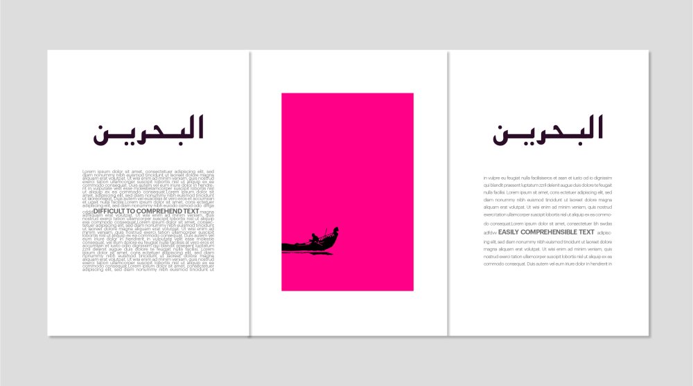
 So how does Whitespace matter anyways? Jumping right into the benefits of understanding and utilizing the knowledge of whitespace, here are a few key points to remember while incorporating this knowledge into your designs.– Ease of comprehension White being the lightest achromatic color, lacks hue & hence is easy on the mind and eye to understand the content better and faster.– Attention Attention! Not featured on a traditional color wheel, this color is considered a non-color and reflects all of its light and colors opposite to black absorbs all colors. This characteristic helps gain attention amongst everything else in a given space.– Call To Action Alerts Mostly white is used to draw attention to your phone on your screen by sending a notification, message, or button that is usually white/ light in color. This digital marketing trick works each time as the human eye tends to be attracted towards the color.– Proximity Matters If you desire to create an efficient and unique artwork that can make an impact, arranging your elements in a manner that have sufficient breathing space and is not very close to each other will ensure you have done a good job.– Too much of anything is harmful Whilst utilizing the free/ negative space theory in the world of design, we must remember that too much of anything might not be good. Limit your use of white space and justify why it is being used in the given context.